This is a concept for a redesigned logo for Wisconsin Waterfowl Association; WWA is a membership-based organization founded in 1984 by and for Wisconsin hunters. The current logo (below) feels outdated, disjointed and the duck — the most important part of their identity — is hard to see, especially when the logo is reduced.
In my redesign I kept the cupped up duck silhouette to retain brand identity, and incorporated more modern and interesting typography with a meaningful color palette. I also included a simple but descriptive tagline to provide better context of the organization. The duck inside the state shape serves as a badge or emblem to use on merchandise and marketing materials, social media icons, etc.
I was aiming for a logo that captures the spirit and core values of the organization, using a visual element that was instantly recognizable and accessible to any age or interest level. So, whether you’re a duck hunter, an environmentalist, a wood decoy carver or just someone who loves looking at ducks and other water birds, the WWA has something for you.
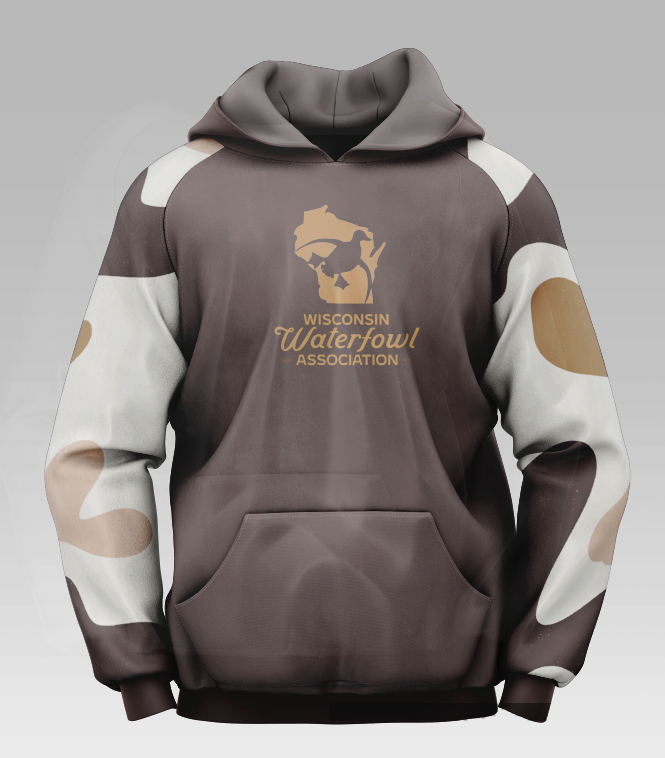
Each level of membership in the WWA offers certain swag, mockups below show how the logo might appear in use.


Examples of logo used on branded merchandise:


